How to Hide the Sidebar on Mobile in Blogger
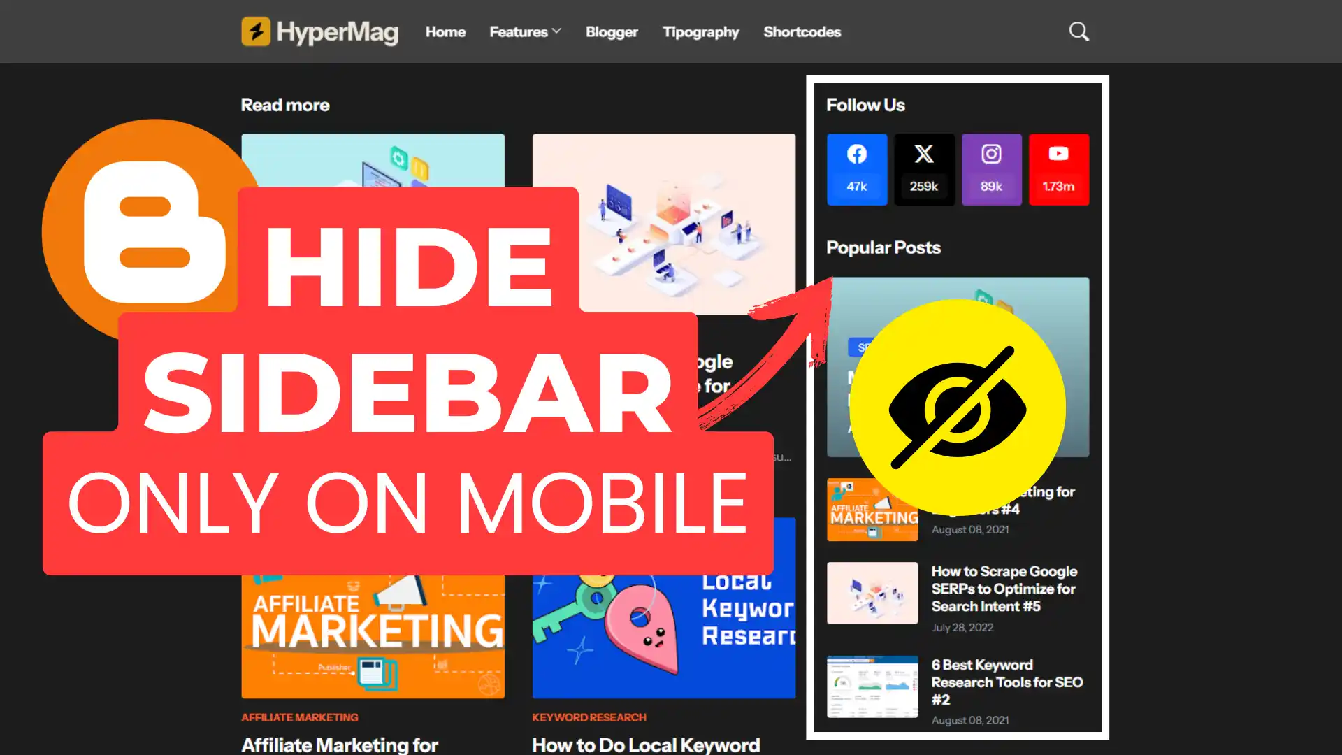
If you are using Blogger platform and want to Hide Sidebar for Mobile and Tablet devices while keeping it in desktop devices then this article is for you.
If you want a cleaner look on mobile by hiding the sidebar, follow this simple guide.
Why You Should Hide the Sidebar on Mobile?
- Enhances mobile user experience
- Makes content more readable
- Reduces clutter for better navigation
Steps to Hide the Sidebar on Mobile
Method 1: Using CSS code
Login to Blogger dashboard. Go to Theme > Edit HTML
Search for the CSS section ( </b:skin> or </style>) tag.
Now Paste the below CSS code just before this tag.
@media (max-width: 768px) {
    #sidebar {
        display: none !important;
    }
}
Now Save the code and After that Sidebar won’t be visible if you access the website from Mobile and Tablet devices.
Use Chrome’s Dev Mode or append ?m=1 to your blog URL to preview mobile view.
Method 2: Using Blogger Conditional Tags
You can also Take the help of Blogger conditional tag to load the Sidebar only in Desktop and Keep it hidden in Mobile screens.
1. Locate the Sidebar Code: In Edit HTML, search for <aside> tags (common in responsive templates). Identify the parent <aside> element containing your sidebar content.
2. Wrap the Sidebar with Conditional Logic: Add <b:if cond=’data:blog.isMobileRequest == “false”‘> after the opening <aside> tag.
Add </b:if> before the closing </aside> tag.
Here is an example of the Code.
<aside>
  <b:if cond='data:blog.isMobileRequest == "false"'>
    ... sidebar widgets ...
  </b:if>
</aside>
3. Save and Validate: Test on both desktop and mobile to ensure the sidebar disappears on smaller screens.
Or you can directly add a simple Blogger conditional tag in the Sidebar Section. (As shown in the Video tutorial).
Follow this reference Article – How to Load widgets or Script only on desktop or mobile devices in Blogger

I recommend you to Take a backup of your theme code before making any changes on the website.
Conclusion
Hiding the sidebar on mobile improves readability and enhances user experience. By using simple CSS, you can ensure your Blogger site looks clean and professional on all devices.
Let us know in the comments if you found this guide helpful!